
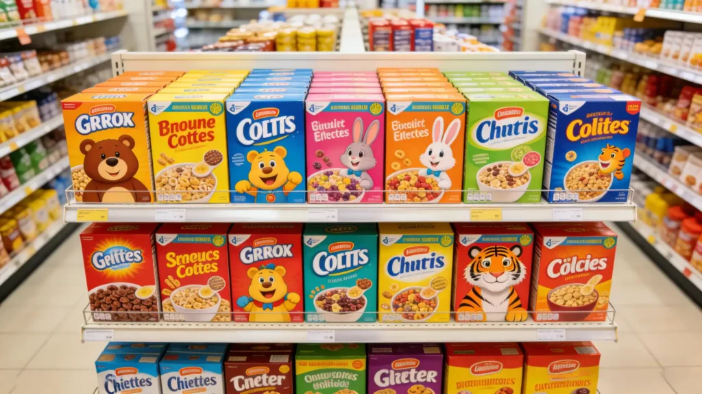
Struggling to make your product pop on a crowded shelf? A bland design gets ignored, leaving your brand unnoticed. A well-designed mascot can be your secret weapon for instant connection.
Cereal mascots are powerful because they act as brand ambassadors. They create an emotional connection, build brand recognition from a young age, and communicate a product's personality instantly. This turns a simple box into a memorable character, driving sales and long-term loyalty for the brand.

I’ve been in the packaging business for over 16 years, and I’ve seen firsthand how a character can transform a product’s success. It’s more than just a drawing; it’s a strategic asset. These characters do a heavy-lifting job on the shelf that simple graphics often can't. To really understand their power, we need to break down what they actually do for the brand. Let's look at their real job.
What's the real job of a cereal mascot on the box?
Want your design to do more than just look good? A mascot that is only a pretty picture is not working hard enough. Its real job is to be a silent salesperson.
The primary job of a cereal mascot is to build trust, tell a story, and guide the consumer's eye. They create an immediate personality for the product, making it feel familiar and friendly. This shortcuts the decision-making process for a shopper, especially a child, in a busy supermarket aisle.

When we design packaging, we are creating the number one sales tool for that product in a retail environment. A mascot isn't just decoration; it has specific functions that are critical for success. As a designer, understanding these roles helps you create a character that truly works for the brand.
They Build an Emotional Bridge
A mascot gives a face to a faceless product. For a child, seeing a friendly character like Tony the Tiger creates a sense of familiarity and trust. It's like seeing a friend on the shelf. This emotional connection is incredibly powerful and builds brand loyalty from a very young age. I remember working on a new health food brand for kids. The initial design was clean but sterile. Adding a friendly, energetic monkey mascot completely changed the dynamic in focus groups. Kids were instantly drawn to it.
They Communicate Brand Values Instantly
A mascot is a visual shortcut for the brand's personality. You don't need to read the box to understand the core message. It's all right there in the character.
| Mascot | Perceived Value | Target Feeling |
|---|---|---|
| Tony the Tiger | Energy, Confidence, Strength | "This will make me strong and great at sports." |
| The Trix Rabbit | Fun, Playfulness, Desire | "This is a fun and delicious treat I really want." |
| Cap'n Crunch | Adventure, Leadership, Trust | "This is a classic, crunchy, and exciting choice." |
They Guide the Customer's Gaze
This is a clever design trick. Studies have shown that we tend to look where a character on a package is looking. Many cereal mascots are designed to look down, either at the product name or at the bowl of cereal. This "gaze-cueing" directs the shopper's attention exactly where the brand wants it to go, reinforcing the product itself.
How do you design a mascot that connects with today's kids and parents?
Worried your character design will feel outdated or miss the mark? Today's families are savvy; they spot inauthentic characters immediately. The key is balancing modern appeal with timeless principles.
To connect today, a mascot must be authentic, have a relatable personality, and feature a simple design that works across digital and physical media. It needs to appeal to both kids with fun and engagement, and to parents with a sense of trustworthiness and subtle health cues.

Designing a mascot today is more complex than it was 30 years ago. You're not just designing for the box anymore. You are designing for a whole brand ecosystem, and you have to win over two different audiences at the same time.
The Dual Audience Dilemma
The biggest challenge is designing for both the user (the child) and the buyer (the parent).
- For Kids: The design needs to be fun, engaging, and have a personality that sparks imagination. Bright colors, dynamic poses, and a sense of action are key. The character should feel like a potential friend or a hero in a story.
- For Parents: Parents are looking for cues of trustworthiness and health. A mascot that looks too mischievous or is only focused on sugar can be a turn-off. Modern mascots often are shown being active, playing sports, or engaging in hobbies. This subtly tells the parent that the brand encourages a balanced lifestyle.
Key Design Considerations for Modern Mascots
When my team and I work on character development, we focus on a few core principles.
- Simplicity for a Multi-Platform World: A modern mascot must look great on the box, but also as a tiny app icon, a social media sticker, or a character in a simple animation. Complex, highly detailed designs don't scale well. Think clean lines and a strong, recognizable silhouette.
- Authentic Personality: Today's kids connect with characters that have more depth. A perfect, always-happy character can feel fake. Giving a mascot relatable goals, quirks, or even minor flaws can make them more endearing and memorable.
- Inclusivity: The world is diverse, and characters should reflect that. This doesn't mean every mascot needs to be human, but their stories and personalities should resonate with children from all backgrounds.
What are the technical challenges of printing mascots on cereal boxes?
Ever had a beautiful design look terrible in production? Vibrant colors on your screen can easily turn muddy and misaligned on the final printed box. Understanding printing limitations is crucial for success.
The main challenges are color consistency, registration accuracy, and material interaction. Ensuring a mascot's vibrant brand colors are identical across millions of boxes printed on porous paperboard requires precise color management (like Pantone) and constant press calibration. Misregistration can cause blurry outlines, ruining the character's appeal.

As a packaging manufacturer, this is where my world and a designer's world must meet perfectly. A designer like Peter might create a stunning character on screen, but if it can't be reproduced consistently on press, the project fails. Here are the issues we tackle every day.
The Battle for Color Consistency
A mascot's color is part of its identity. Imagine Tony the Tiger in a faded, weak orange, or the Trix Rabbit in dull pink. It breaks the brand promise.
- CMYK vs. Spot Colors: Standard printing uses four colors (CMYK). For critical brand colors, we often add a fifth or sixth "spot" color, like a specific Pantone ink. This ensures that exact shade of orange is perfect every time, but it adds cost and complexity.
- Dot Gain: Paperboard is absorbent. When a tiny dot of ink is printed, it spreads slightly as it soaks in. This is called dot gain. We have to predict and compensate for this in the prepress stage, otherwise, the colors will look darker and muddier than intended.
The Precision of Registration
A character is printed using multiple color plates laid on top of each other. Registration is the process of making sure these plates align perfectly.
| Registration Quality | Visual Outcome on Mascot |
|---|---|
| Good Registration | Crisp, sharp black outlines. Colors are contained perfectly. |
| Bad Registration | Blurry or "ghosted" outlines. Colors bleed outside the lines. The character looks cheap and poorly made. |
Even a misalignment of a fraction of a millimeter can ruin the entire image. This requires highly calibrated machines and skilled press operators.
Material Matters
The type of paperboard used for the box has a huge impact. A coated board has a smooth, sealed surface, so ink sits on top, looking bright and sharp. An uncoated, more recycled-looking board is more porous, so ink soaks in more, which can reduce vibrancy. The designer must know the final material before they finalize their color palette. As someone who has managed countless print runs, the dialogue between the designer and the printer is the most important step. A designer who understands these technical aspects is invaluable.
Conclusion
Cereal mascots are more than just drawings. They are strategic assets that bridge design, marketing, and production to build lasting brand loyalty, from the shelf to the breakfast table.


