Your brand colors look perfect on screen, but terrible in print. This inconsistency can damage your brand's image. Using the Pantone Matching System (PMS) ensures your colors are always perfect.
The Pantone Matching System (PMS) is a standardized color library used in printing to ensure color consistency. Each color has a unique code, so designers and printers can reproduce the exact same shade anywhere in the world, on any compatible material. This eliminates guesswork and protects your brand's integrity.

As someone who has been in the packaging industry for over 16 years, I've seen firsthand how color can make or break a product's success. A client's entire brand identity is often tied to a specific shade, and getting it wrong is not an option. That’s why understanding color systems is so fundamental to creating high-quality, professional custom printed boxes. It's the difference between a product that looks cheap and one that looks premium. Let’s dive into why the Pantone system is the gold standard for brand color consistency and how you can use it to your advantage.
How does the Pantone Matching System actually work?
You need to describe a specific color to your printer. Saying "a nice, deep blue" is a recipe for disaster. The Pantone Matching System (PMS) uses simple codes to define exact colors.
The PMS works by assigning a unique code to each of its 2,000+ spot colors. Printers use the official Pantone Formula Guide, which provides the exact ink mixing ratios to create that color. This scientific approach removes all subjectivity and guarantees global consistency for your brand's packaging.

Let's break this down further. The system is built on a foundation of base inks that can be mixed to create a massive spectrum of colors. When a designer like Peter selects a color, say PANTONE 185 C, he isn't just picking a red. He is choosing a precise formula. This code is then sent to us, the manufacturer. My team doesn't have to guess what "brand red" means; we simply look up the formula for PANTONE 185 C and mix the inks to those exact specifications. It’s a universal language for color.
The Importance of Paper Stock
A crucial detail is the letter at the end of the code, usually a 'C' or a 'U'. This tells the printer about the paper finish.
- C = Coated: For glossy or coated paper, which makes colors appear more vibrant and saturated.
- U = Uncoated: For matte or uncoated paper, which absorbs more ink and can make colors appear slightly duller.
The same ink formula will look different on these two surfaces. I remember a project for a luxury cosmetics brand. They chose a beautiful deep purple for their paper box packaging. The initial proof on coated paper was perfect, but they also wanted an uncoated version for their inserts. Without adjusting for the paper type, the purple on the inserts looked muted and cheapened the brand's feel. We had to show them the 'U' version of their color to get the right match. This is why a physical Pantone guide is so vital.
| Paper Type | PANTONE 293 Color Appearance | Best For |
|---|---|---|
| Coated (C) | Bright, vibrant, and saturated blue. Reflects more light. | Luxury packaging, product boxes, marketing materials. |
| Uncoated (U) | Softer, more muted blue. Absorbs more ink. | Business cards, letterheads, rustic-style packaging. |
What's the real difference between PMS and CMYK printing?
You see printing options for PMS and CMYK. Choosing the wrong one is a common and costly mistake for any brand. Understanding when to use each process is key to getting professional results.
PMS, or spot color, uses pre-mixed solid inks to create an exact color. It is perfect for brand logos. CMYK, or process color, mixes four inks (Cyan, Magenta, Yellow, Black) in tiny dots to create a spectrum of colors. It is best for full-color photographs.

To help you understand this better, think of it like painting a wall. Using a PMS color is like buying a can of paint that is the exact shade you want. It's pure, solid, and consistent. CMYK printing is like having four buckets of primary paint colors and mixing them on the wall itself to create the color you need. From a distance, it looks right, but up close, you can see how it was made. This difference is critical in packaging. For example, the iconic Tiffany Blue® is a custom PMS color. If it were printed in CMYK, it would risk looking like a cheap imitation, damaging a brand identity built over decades.
When to Use Which Method
Choosing between PMS and CMYK often comes down to the specific project's needs and budget. You don't always need one or the other; sometimes, projects even use both (a five-color print job). For a packaging designer like Peter, knowing the pros and cons is essential for advising clients.
- Use PMS when: Brand color consistency is your top priority. Your design uses one, two, or three solid colors. You need colors that CMYK cannot accurately reproduce, like metallics, neons, or very specific vibrant hues.
- Use CMYK when: Your design involves full-color photographs or has many different colors and gradients. Budget is a major concern, as running a four-color process job can be more economical than a five or six PMS color job.
Here is a simple table to guide your decision:
| Feature | PMS (Spot Color) | CMYK (Process Color) |
|---|---|---|
| Best For | Logos, brand colors, 1-3 color jobs | Full-color photos, complex images |
| Color Accuracy | Very High (Consistent across all prints) | Good (Can have slight variations) |
| Cost | Cost-effective for few colors, expensive for many | Cost-effective for multi-color images |
| Color Range | Includes metallics, neons, pastels | Wide range, but can't hit all PMS colors |
I often advise clients who are launching a new product to invest in PMS printing for their primary logo packaging. It establishes a strong, consistent brand color from day one.
Why is using PMS colors so important for brand identity?
Your brand needs to stand out and be instantly recognizable. Inconsistent colors across your packaging and marketing materials look unprofessional and confuse customers. PMS ensures your brand color is always the same, building trust.
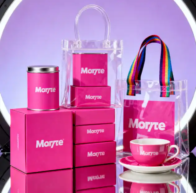
Using a specific PMS code guarantees that your "brand red" is the exact same shade on your boxes in Shanghai, your brochures in New York, and your ads in London. This consistency is the foundation of a strong, memorable, and trustworthy brand identity that customers can rely on.

Think about the world's most successful brands. Coca-Cola's red, Starbucks' green, Cadbury's purple—these colors are instantly recognizable because they are ruthlessly consistent. This consistency isn't an accident; it's the result of strict color management using systems like Pantone. When a customer sees that specific color, their brain immediately connects it to all the experiences and feelings they have associated with that brand. It's a powerful psychological shortcut. If that color changes from one package to the next, that connection weakens. The customer might subconsciously wonder if the product is a fake or if the company is less professional.
Building Trust Through Color
In my experience at Giftspack, the brands that grow the fastest are the ones that understand this from the beginning. They treat their PMS color as a non-negotiable asset. Here’s how it directly impacts brand identity and value:
- Professionalism: Consistent color shows attention to detail. It tells the customer that you care about quality, not just in your product, but in your entire presentation. This is especially true for items like jewelry boxes, where perceived value is everything.
- Differentiation: In a crowded market, a unique and consistent color can help you stand out. Your PMS color becomes your silent salesperson on the shelf, grabbing attention and setting you apart from competitors.
- Recognition: Repetition builds memory. The more a customer sees your consistent brand color, the faster they will recognize and recall your brand, leading to increased loyalty and easier purchasing decisions.
A few years ago, we worked with a startup in the organic snack industry. They chose a very specific earthy green. By using their PMS code on everything—from their flexible pouch packaging to their shipping boxes—they built a powerful brand presence in just a couple of years. Customers knew that specific green meant healthy, high-quality snacks. That is the power of PMS in action.
Conclusion
In short, using the Pantone Matching System is crucial for brand consistency. It ensures your packaging color is always accurate, professional, and recognizable, protecting and strengthening your brand identity.