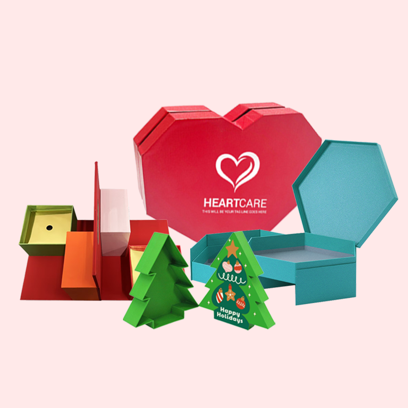
Are your packaging designs starting to feel a bit outdated? Using last year's trends can make your brand look old, hurting customer interest and sales. Let's look at what's next.
For 2025, top packaging trends include eco-minimalism that highlights sustainable materials, vibrant gradients for a modern feel, AI-generated art for unique personalization, retro-inspired typography, and tactile textures. These trends focus on creating an emotional connection and a memorable unboxing experience for the customer.
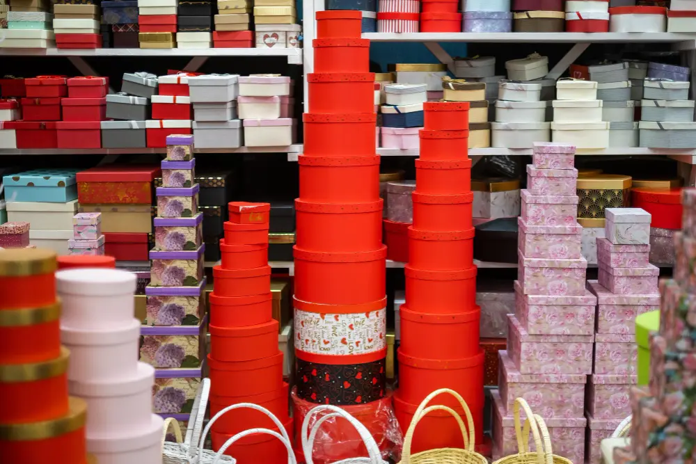
These trends are more than just passing fads. They are powerful tools that can solve brand challenges and connect with what today's consumers really want. I have seen how the right design can transform a product's success. Let's dive deeper into how you can use these ideas to make your packaging stand out and tell a compelling story. It's time to get ahead of the curve.
How Can Eco-Minimalism Make Your Packaging Stand Out?
Brands want to show they are sustainable, but green designs can sometimes look plain. Overly complex "eco-friendly" messages can also confuse customers. Eco-minimalism is the answer, offering a clean and honest style.
Eco-minimalism uses fewer materials and inks, with a focus on clean typography and natural textures. This approach clearly communicates sustainability and elegance. It helps build consumer trust and can also lower production costs. Put simply, it’s about making a bigger impact with less.
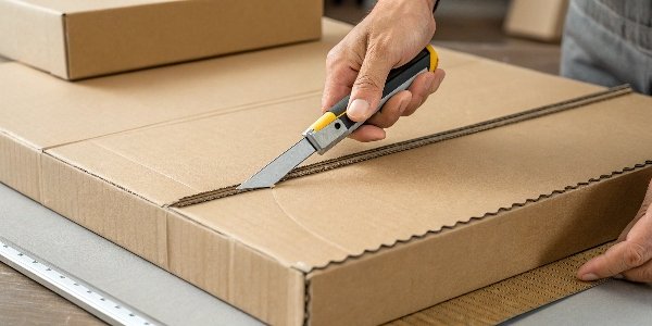
In my 16 years in this business, I've seen that simplicity often works best. The core idea of eco-minimalism is "less is more." It strips away unnecessary elements to let the product and the brand's sustainable values shine. This isn't just about looking good; it is about being responsible. For a designer like Peter, this means shifting focus from adding more graphics to choosing the right materials and finishes. It’s a design philosophy that connects with a growing number of consumers who value transparency and environmental consciousness. I worked with a cosmetics brand that switched to a simple, unbleached box with soy-based ink. Their sales went up because customers felt the packaging reflected the natural ingredients inside.
Material is the Message
In eco-minimalism, the material you choose does most of the talking. Instead of covering a box with heavy printing, you let the raw texture of recycled paper or the unique fibers in a sugarcane-based material become part of the design. This creates an authentic, tactile experience that feels premium and honest. It tells your customer that you care about quality right down to the source.
The Power of White Space
White space, or negative space, is your best friend in minimalist design. It gives your artwork room to breathe and directs the customer's eye to the most important information, like your logo or product name. A clean layout suggests confidence and sophistication. It avoids overwhelming the consumer and makes the unboxing experience calm and focused.
| Design Element | Traditional Approach | Eco-Minimalist Approach |
|---|---|---|
| Material | Coated art paper | Recycled or FSC-certified paper |
| Printing | Full-color CMYK | One or two-color pantone |
| Finishing | Glossy lamination | Matte varnish or embossed logo |
| Structure | Complex inserts | Simple, clever folds |
Why Is Retro Design Making a Huge Comeback in Packaging?
In a world full of modern, digital designs, it can be hard to stand out. Many new styles look the same and lack a human touch. That's why retro design is coming back.
Retro design uses nostalgic fonts, colors, and illustrations to create a feeling of comfort and trust. It reminds customers of simpler times, making your product feel familiar and dependable. This emotional connection can be a powerful way to win over shoppers and build lasting brand loyalty.
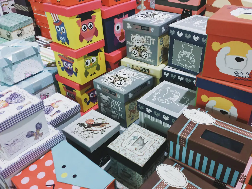
I believe this trend is popular because it offers a break from the clean, often cold, look of digital-first brands. It feels authentic. For designers like Peter, this is a great chance to explore rich design history. You can pull inspiration from the bold typography of the 70s, the charming mascots of the 50s, or the simple patterns of the 60s. I recently helped a coffee company develop packaging with a vintage feel. We used an old-style font and a simple two-tone color scheme. Customers loved it. They said it reminded them of the coffee their parents used to drink. That connection is priceless.
The Psychology of Nostalgia
Nostalgia makes us feel good. When people see a design that reminds them of their past, it triggers positive emotions. A brand that uses retro elements is borrowing that warmth and trust. This is especially effective for food, drinks, and personal care products, where comfort and familiarity are important selling points. The design doesn't just sell a product; it sells a feeling.
Modernizing Retro Elements
The key to a successful retro design is not just copying the past. It's about taking classic elements and giving them a modern twist. For example, you might use a vintage-inspired font but pair it with a bright, contemporary color palette. Or you could use a classic illustration style but print it on sustainable, textured paper. This keeps the design from looking dated and shows that your brand is both rooted in tradition and looking toward the future.
| Retro Decade | Key Design Elements | Modern Application |
|---|---|---|
| 1950s | Cheerful mascots, pastel colors | Simplified character art, muted tones |
| 1970s | Groovy fonts, earthy colors | Bold typography as a central focus |
| 1980s | Neon colors, geometric shapes | Bright color accents, minimalist patterns |
Are Vibrant Gradients and Abstract Shapes Key for 2025?
Making a product pop on a crowded shelf is a constant struggle. Simple, flat colors can get lost in the noise. This is where bold designs can make all the difference.
Yes, vibrant gradients and fluid abstract shapes are essential for 2025. They create a dynamic sense of energy and movement that grabs attention instantly. This style is perfect for modern, forward-thinking brands, especially in tech, beauty, and wellness, helping them stand out both online and in stores.
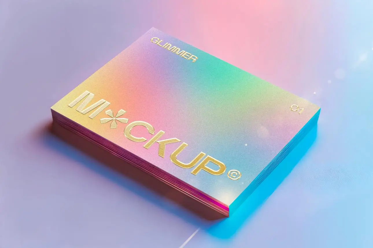
This trend is driven by our digital lives. We are used to seeing smooth color transitions on our screens, and bringing that aesthetic to physical packaging creates a satisfying connection between the two worlds. I've guided many clients to use gradients to great effect. For example, a beverage company I worked with used a gradient that went from a cool blue to a warm orange. It visually represented the drink's refreshing yet energizing flavor. For a designer like Peter, this is a chance to play with color theory in new ways. The trick is to ensure the gradients are high-quality in print, as poor printing can ruin the effect.
Communicating Emotion with Color
Gradients are not just for decoration; they are a powerful tool for visual storytelling. A smooth transition from a dark to a light color can suggest transformation or a day-to-night product. A blend of warm colors can evoke feelings of energy and passion, while cool colors can create a sense of calm and clarity. The abstract shapes add to this, creating a flow that guides the customer's eyes around the package.
Digital-First Design
This trend works exceptionally well for e-commerce brands. The bright colors and dynamic shapes look fantastic on a screen, making product photos on websites and social media feeds much more engaging. When the customer finally receives the physical product, the beautiful packaging confirms their online impression and elevates the unboxing experience. It is a perfect example of designing for both the digital and physical shelf.
| Trend Element | What It Communicates | Best For |
|---|---|---|
| Soft Gradients | Calmness, wellness, technology | Skincare, tech, health drinks |
| Bold Gradients | Energy, creativity, fun | Snacks, energy drinks, artistic products |
| Fluid Shapes | Natural flow, gentleness, innovation | Cosmetics, organic foods, lifestyle brands |
Conclusion
Looking ahead to 2025, packaging design is all about connection. Eco-minimalism, retro styles, and vibrant gradients are more than trends; they are ways to build trust and create memorable brand experiences.

