A luxury gift box can look stunning on screen and still fail in production.
That sounds harsh, but it happens all the time. A designer creates a beautiful front panel, the logo looks perfectly centered, the color palette feels refined, and everyone approves the visual direction. Then the printed sample arrives. The wrap seam is too obvious. The foil lands too close to the edge. The side panel feels empty. The lid looks elegant, but the inside print feels disconnected. Suddenly the box still looks “good,” but not premium in the way everyone expected.
That is why gift box artwork setup matters so much. In packaging, the artwork is not floating on a screen. It has to wrap around structure, align with folds, survive production tolerances, and still feel balanced from every angle. Good gift box artwork is not only graphic design. It is graphic design that understands structure, material, and finish. If you want a packaging result that feels clean and expensive in real life, the file setup stage deserves more attention than most brands give it.
If you are preparing artwork for premium packaging, it helps to think beyond the front view and work closely with the actual packaging artwork design and structure from the start. That is usually what separates a box that looks nice from a box that feels properly resolved.
1. Packaging Artwork Is Not the Same as Flat Graphic Design
This is the first thing many teams underestimate.
A gift box is not a poster, not a brochure, and not a social media visual. The design has to live on a three-dimensional object. That means the artwork does not only need to look attractive. It needs to behave properly once it is printed, wrapped, folded, glued, and opened.
That changes the design job completely.
A layout that feels balanced on a flat screen may feel awkward once it wraps around corners. A logo that seems perfectly placed in the file may drift visually once the lid depth and side panels come into play. Even empty space behaves differently on a real box than it does in a mockup.
In luxury packaging, that difference matters more because customers notice proportion quickly. If something feels slightly off, the whole box feels less refined.
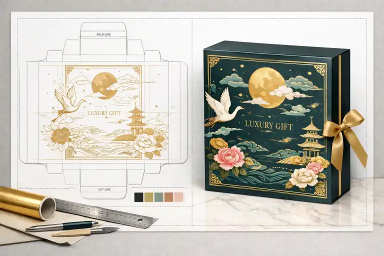
2. Always Start from the Correct Dieline
Good packaging artwork should never begin on guesswork. It should begin with the correct dieline or structural layout from the supplier.
This matters because the dieline tells you where the real panels are, where the wrap edges fall, where the folds happen, and which areas need to stay clear for production. Without that, the design may look good visually but still cause avoidable problems later.
Before artwork begins, confirm:
- The final box dimensions
- Panel layout and fold positions
- Wrap or turn-in areas
- Glue or overlap areas if relevant
- Safe zones for important text and logos
This is why artwork should always be developed alongside real structural design, not separately from it.
3. The Front Panel Is Not the Whole Story
A lot of packaging design energy goes into the front panel, and that makes sense. It is usually the hero view. But on a gift box, premium quality is often judged by what happens after the front panel.
The top, sides, inside lid, base, and even the wrapped edge areas all contribute to how complete the box feels. A front panel can be elegant, but if the side panels look ignored or the inside feels unrelated, the overall result becomes weaker.
That is why luxury box artwork should be reviewed from all angles:
- Top view
- Front view
- Side view
- Opened view
- Interior view
Premium packaging is usually convincing because the whole object feels considered, not because one panel looks expensive.
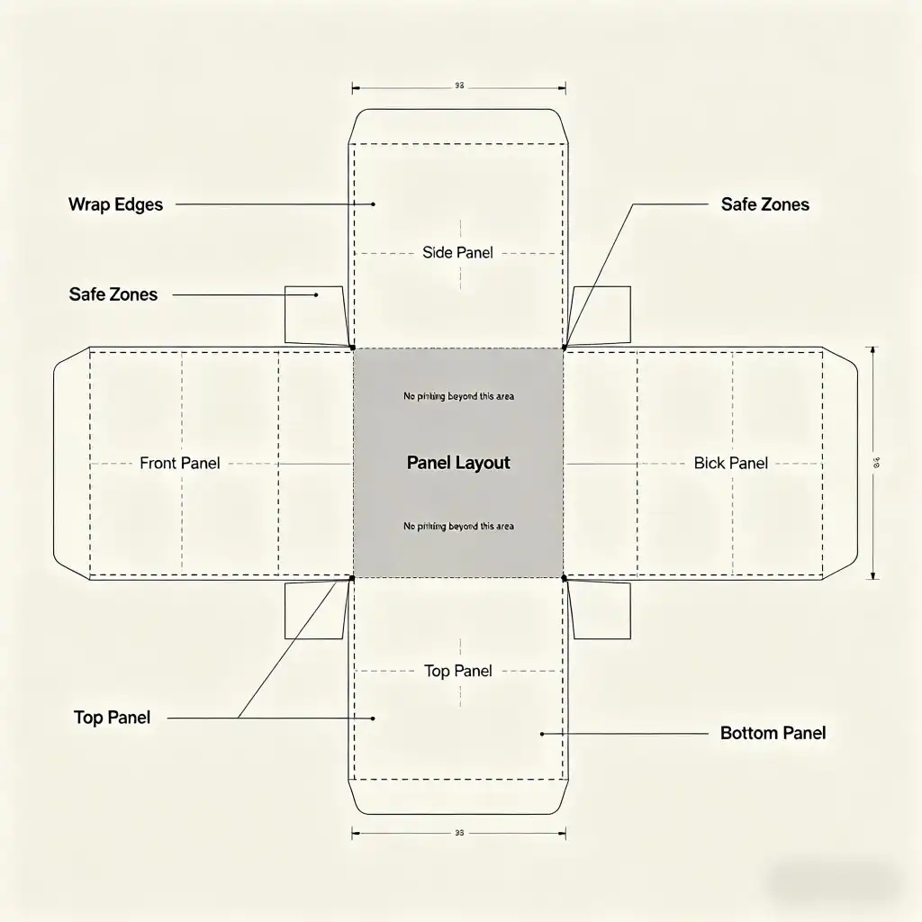
4. Safe Areas Matter More Than People Think
One of the most common production mistakes is placing important elements too close to edges, folds, or wrap areas. On screen, it may look dramatic or clean. In production, it can quickly become risky.
Luxury packaging especially needs breathing room. Logos, product names, borders, and fine graphic details usually look better when they are given a little more space than a designer first expects.
When preparing files, keep important elements away from:
- Cut or fold edges
- Wrap turn-in areas
- Corners where paper tension may shift appearance
- Magnet positions or structure joints if applicable
Boxes are physical objects. Paper wraps. Tolerances happen. The safest artwork is usually the artwork that respects those realities early.
5. Wrap Areas and Turn-Ins Need Real Attention
This is where packaging artwork often separates experienced packaging designers from general graphic designers.
Luxury rigid boxes usually include wrapped paper that turns into the inside edges of the box. That means parts of the design may continue, disappear, or partially wrap depending on how the artwork is built. If the designer ignores this, the final sample can look strangely cut off or visually unbalanced.
When setting up artwork for wrapped boxes, it helps to confirm:
- Which areas are fully visible from the outside
- Which areas wrap into the inside edge
- Where seams or joins may appear
- Whether patterns, textures, or solid colors should continue into the turn-in area
These details may sound technical, but they strongly affect whether the final box feels clean or careless.
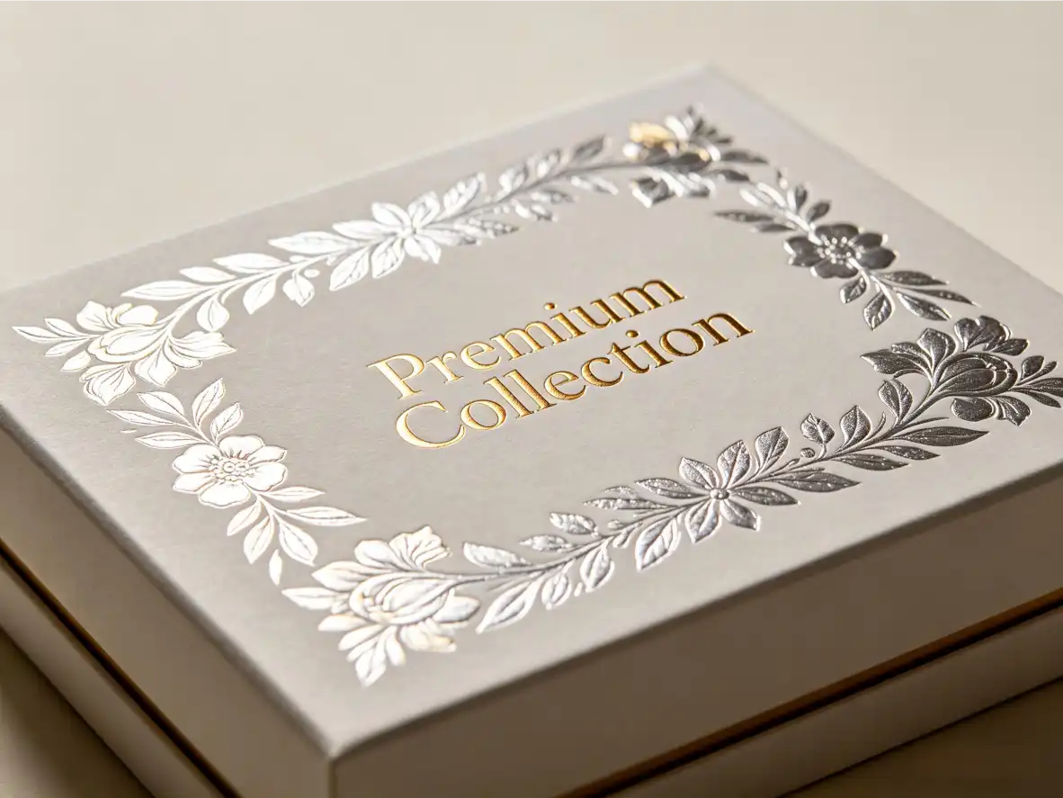
6. Finishes Need Their Own Logic, Not Just Their Own Layer
Foil stamping, embossing, debossing, spot effects, matte surfaces, soft-touch finishes. These details often help make a gift box feel premium. But they should never be treated like decoration added at the end just because the file has room for one more layer.
In strong luxury packaging, finishes have a purpose. They guide the eye, add depth, or support brand tone. They do not compete with everything else.
When planning finishes, ask:
- What should the eye notice first?
- Does the finish support the brand mood?
- Will the effect still look refined in real light?
- Is the artwork simple enough to let the finish breathe?
Sometimes one subtle foil logo does more than three different effects fighting for attention.
7. Foil Placement Needs Restraint and Precision
Foil can make a box feel elegant very quickly, but it can also make a box feel overworked just as quickly.
The most common problems are usually not the foil itself. They are placement and scale. A foil logo too close to an edge, a large foil area that feels heavy, or multiple metallic elements competing with each other can push the design away from luxury and toward visual noise.
Foil tends to work best when:
- The artwork is already clean
- The logo or message is important enough to deserve emphasis
- The foil area is not too crowded by other graphics
- The color and surface beneath it support the effect well
Good foil use feels intentional. It should not feel like the design is trying to prove it is premium.
8. Embossing and Debossing Need Space to Work
Embossing and debossing often look most expensive when they are given room. If they are applied to tiny, busy, over-detailed artwork, the effect can disappear or feel unclear. But when used on a clean logo, monogram, or short title, they can add quiet luxury very effectively.
This is why these finishes usually work best with:
- Simple logo shapes
- Minimal typography
- Calmer layouts
- Surfaces that let light catch the depth gently
Packaging that relies on depth rather than shine often feels more confident, especially in premium gifting.
9. Color on Screen Is Not Color in Hand
This sounds basic, but it is one of the reasons sample review is so important. The color that feels soft and elegant on a monitor may print darker, flatter, colder, or more saturated than expected once it is on actual material.
Material choice affects color. Finish choice affects color. Lighting affects color. Even the size of the printed area affects how color feels on a physical box.
That is why luxury packaging should not be approved based on screen confidence alone. Colors that feel premium digitally still need to be checked on a real sample.
This becomes even more important with:
- Muted neutrals
- Pastel tones
- Deep dark colors
- Minimalist designs where color does more of the emotional work
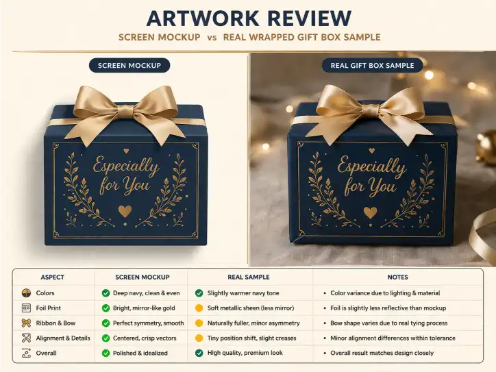
10. Common Mistake: Designing Only for the Mockup
Mockups are useful. They help teams imagine the final direction. But a mockup can also be dangerously flattering.
It may hide a seam. It may idealize alignment. It may not show the real box depth properly. It may make spacing feel cleaner than it will be once the artwork wraps onto a physical structure.
This is one reason some packaging looks excellent in presentation files and only average in real life. The design was built for the mockup view instead of the actual production reality.
A better approach is to ask during review:
- Would this still feel balanced from side angles?
- What happens where the wrap turns in?
- Does this logo still look centered once the full lid is visible?
- Will this empty space still feel intentional in the real sample?
Those questions usually lead to stronger packaging decisions.
11. Common Mistake: Ignoring the Inside of the Box
Luxury gift boxes are opened. That sounds obvious, but many artwork files still behave as if the inside does not matter.
The inside lid, the base wrap, the insert color, and the relationship between interior and exterior all shape the final impression. If the outside feels refined but the inside feels empty or disconnected, the box loses some of its premium credibility.
The inside does not need to be dramatic. In many cases, subtlety works better. But it should still feel like part of the same packaging language.
That might mean:
- A printed message inside the lid
- A coordinated interior color
- An insert surface that matches the outer mood
- A clean continuation of brand identity without overfilling the space
12. Common Mistake: Sending Files Without Clear Production Notes
A file can be technically correct and still create production confusion if the supplier has to guess what the designer intended.
That is why it helps when the artwork file is organized clearly and supported by simple production notes where needed. For example:
- Which layer is foil
- Which area is embossing
- Which colors are reference-critical
- Which areas must stay clear of seams or folds
The easier the intent is to understand, the fewer chances there are for preventable mistakes later. Good file preparation is partly about design and partly about communication.
13. Prototyping Is Where Artwork Becomes Honest
At some point, the file has done all it can do. After that, the truth belongs to the sample.
This is where teams see whether the artwork really works on the chosen box. Does the layout still feel balanced? Does the finish support the mood? Does the paper surface help or hurt the concept? Does the box feel expensive when handled, not just when viewed from one angle?
That is why early samples and prototyping matter so much. They are not only checking production quality. They are checking whether the artwork still feels believable once it becomes a real object.
14. Good Artwork Setup Feels Invisible in the Final Result
The best luxury gift box artwork usually does not make people think about file prep, wrap areas, or panel alignment. It simply makes the box feel right.
The logo sits where it should. The finish feels controlled. The inside and outside belong together. Nothing feels random. Nothing feels forced. The packaging just looks resolved.
That is usually the sign that the artwork setup was done properly. Not flashy files. Not complicated layers. Just a finished box that feels calm, expensive, and complete.
Conclusion
Gift box artwork setup is one of the most important parts of premium packaging because it decides whether the design will still feel convincing after it becomes a real box. In luxury packaging, the front panel alone is never enough. Safe areas, wrap zones, panel balance, finish placement, interior design, and prototype review all shape the final result.
The strongest packaging usually comes from treating artwork as part of production reality, not just part of visual design. That means starting from the correct dieline, aligning the artwork with the structure, planning finishes with restraint, and checking the result through real prototypes before mass production begins.
If you are preparing a luxury box project, it is worth reviewing the file through professional artwork design support, checking panel logic with proper structural planning, and confirming the final look through a physical sample before approval.
FAQ
What is the most important thing in gift box artwork setup?
Starting with the correct dieline is one of the most important steps because it determines how the design will fit the real structure, folds, and wrap areas.
Why can packaging artwork look good on screen but weak in production?
Because packaging is a physical object. Wrap areas, folds, materials, lighting, and finishes can all change how the design feels once it is produced.
Should foil and embossing be added late in the design process?
They can be planned later, but they should still follow a clear visual purpose. Finishes work best when they support the design rather than being added just to make the box look more expensive.
Why is the inside of a gift box important in artwork setup?
Because luxury gift boxes are opened and experienced in full. If the inside feels disconnected, the whole package can feel less premium.
Should artwork be checked through a physical sample before mass production?
Yes. A physical sample helps confirm color, alignment, finish effect, and overall balance in ways a screen or mockup cannot fully show.