Your product is great, but it gets lost on the shelf. You need packaging that makes customers remember your brand. Let's make your packaging instantly recognizable.
To maximize brand recognition, focus on a consistent visual identity using unique color palettes, distinct typography, a memorable logo, and a cohesive design system across all packaging. This creates a strong, unforgettable brand presence that customers can easily spot and remember.

These elements are the building blocks of brand recognition. But simply knowing them isn't enough. The real magic happens when you understand how to weave them together into a powerful and cohesive strategy. How do you actually use these tools to build a brand that not only stands out but also builds a lasting connection with your customers? Let's dive deeper into the specific strategies that will make your brand unforgettable.
How Can Color and Typography Create an Unforgettable Brand Identity?
Generic colors and fonts make your package invisible on the shelf. This lack of distinction hurts your brand's recall and sales. A unique color and font choice can make your brand memorable.
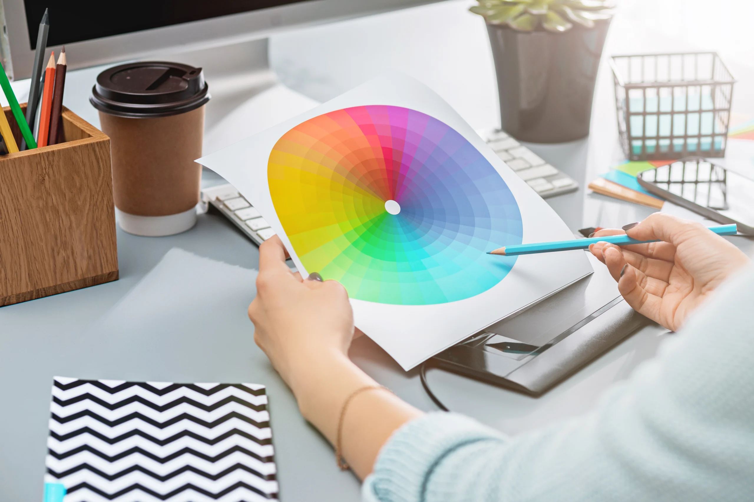
Use a signature color palette that evokes the right emotions for your brand and a distinctive font for your name and messaging. These unique visual cues help customers quickly identify your product and differentiate it from competitors on a crowded shelf, building instant recognition.

I've seen firsthand how the right color and font can transform a brand. It’s about more than just looking nice; it’s about creating a psychological shortcut in your customer's mind. Every time they see that specific shade of blue or that elegant script, they should think of you.
Choosing Your Palette
Color is your most powerful, non-verbal communication tool. It triggers emotions and associations faster than words. When my team and I work with a new client, we don't just pick pretty colors. We explore what the brand stands for. Is it natural and organic? Then greens and browns are a good start. Is it luxurious and sophisticated? Deep purples, blacks, and metallic golds might be better. A good rule of thumb is the 60-30-10 rule: 60% for a dominant brand color, 30% for a secondary color, and 10% for an accent. This creates balance and keeps the design from feeling cluttered.
Selecting the Right Font
Typography is the voice of your brand. It can be bold and modern, or classic and trustworthy.
| Font Style | Brand Association |
|---|---|
| Serif | Traditional, Reliable, Elegant |
| Sans-serif | Modern, Clean, Direct |
| Script | Personal, Fancy, Creative |
| Slab Serif | Bold, Confident, Strong |
Legibility is key. A font can look beautiful, but if customers can't read the product name or information easily, the design has failed. I remember a client in the luxury chocolate business. We switched their packaging from a generic brown to a deep jewel-toned purple. This single change, paired with an elegant serif font, instantly elevated their brand perception. Sales increased by nearly 20% in the first quarter alone.
Why is a Consistent Visual System Crucial for Your Packaging?
Your different products look like they come from different brands. This confusion weakens customer trust and loyalty. A consistent system builds trust and makes your entire product line recognizable.
Consistency across all your packaging builds a reliable and recognizable brand image. When customers see the same logos, colors, and design layouts on different products, it creates a sense of familiarity and trust, reinforcing brand recall every time they shop.

Think of your favorite brands. You can spot them from across the store, right? That’s not an accident. It’s the result of a disciplined and consistent visual system. This system is a set of rules that governs how your brand's visual elements are used. After 16 years in this business, I can tell you that the most successful brands are the most consistent ones.
The Power of Repetition
A visual system creates a framework for every piece of packaging. It dictates things like logo placement, the hierarchy of information, and the style of photography or illustration. For example, the logo might always be in the top-left corner, and the product name is always in the same bold font. This repetition makes your brand easy to learn. When a customer buys your shampoo and has a good experience, that consistency makes them more likely to trust and buy your conditioner, even if they've never tried it before. It connects all your products into a single, trustworthy family.
Creating a Packaging Style Guide
For a designer like Peter, a brand style guide for packaging is an essential tool. It ensures that everyone, from the internal design team to external partners, applies the brand identity correctly. This guide should detail:
- Logo Usage: Clear space, minimum size, and placement rules.
- Color Palette: Primary and secondary colors with their specific codes (CMYK, Pantone).
- Typography: Defined fonts for headlines, body text, and legal copy, including size and weight.
- Imagery Style: Guidelines for photos or illustrations.
One of our clients sells a wide range of organic snacks. We created a system where the core brand element—a stylized leaf logo—was always in a fixed position, while a unique color and illustration represented each flavor. This allowed for variety while maintaining a strong, unified brand presence on the shelf.
What Role Does Structural Design Play in Brand Storytelling?
Your box is just a box, failing to excite or engage customers. This missed opportunity means a weaker brand connection. Your packaging's shape and function can tell a powerful brand story.
The physical structure of your packaging—its shape, materials, and unboxing experience—is a powerful storytelling tool. A unique structure can communicate brand values like luxury, innovation, or sustainability, creating a memorable tactile experience that deepens the customer's connection to your brand.

Great packaging design goes beyond what you see. It’s also about what you feel. The weight of the box, the sound it makes when it opens, the way the product is presented inside—all of these physical cues send a message. As a designer, you are creating a physical introduction to the product. You have the chance to make that introduction exciting and memorable.
The Unboxing Experience
In the age of social media, the unboxing experience is more important than ever. It’s a marketing opportunity. A thoughtfully designed unboxing can create a moment of delight that customers want to share. Think about revealing the product slowly through layers or using custom inserts that hold it perfectly in place. We once designed a box for a high-end watch that had several layers to unwrap. Each layer featured a small piece of text about the brand's history. The customer wasn't just opening a product; they were on a journey. This created a huge amount of buzz online and made the product feel even more special.
Materials and Form
The materials and shape of your packaging say a lot about your brand.
| Structural Feature | Brand Message |
|---|---|
| Rigid box, magnetic closure | Luxury, Premium, High-Value |
| Raw kraft paper, simple fold | Natural, Eco-friendly, Honest |
| Unique die-cut shape | Creative, Innovative, Playful |
| Minimalist, thin cardboard | Efficient, Modern, Sustainable |
The shape doesn't have to be a standard rectangle. A bottle of perfume in a box shaped like a flower petal or a children's toy in packaging that transforms into a play set adds value and strengthens the brand story. The structure is your chance to be creative and provide a tangible experience that graphics alone cannot.
How Can Sustainable Packaging Choices Enhance Brand Image?
Customers are increasingly avoiding brands with wasteful packaging. This negative perception can harm your reputation and sales. Using sustainable materials can actually boost your brand image.
Choosing sustainable materials like recycled paper, biodegradable films, or FSC-certified cardboard shows your brand is environmentally responsible. This resonates with modern consumers, building a positive brand image and fostering loyalty among those who value sustainability and corporate ethics.

Sustainability isn't just a buzzword anymore; it's a core expectation for many customers. In my experience, showing a commitment to the environment is no longer optional for brands that want to grow. It's a powerful way to connect with a huge segment of the market and build a brand that people feel good about supporting.
Communicating Your Green Commitment
Choosing sustainable materials is the first step. The second is making sure your customers know about it. You can do this directly on the packaging. Use clear and simple icons like the recycling symbol or FSC (Forest Stewardship Council) logo. A short line of text like "Made from 100% recycled materials" or "Please compost this box" can be very effective. This transparency builds trust. It shows you aren't just making a great product, but you're also thinking about its impact on the planet. This story of responsibility becomes part of your brand's identity.
Balancing Cost and Conscience
I often talk with designers like Peter who are concerned about the cost of sustainable materials. It’s true that some eco-friendly options can be more expensive upfront. However, I encourage them to look at the bigger picture. The value you gain in brand loyalty and positive public image can far outweigh the initial cost. Also, sustainability can inspire creativity. "Less is more" is a great principle here. Minimalist designs that use less material and less ink are not only cheaper to produce but are also seen as modern and environmentally conscious. Many startups I’ve worked with have made sustainability a core part of their brand from day one. They found that customers were willing to pay a small premium for packaging that aligned with their values. This isn't just a trend; it's the future.
Conclusion
In short, powerful brand recognition comes from a mix of smart visuals, consistent application, memorable structure, and responsible choices. These strategies build a brand customers remember and trust.


