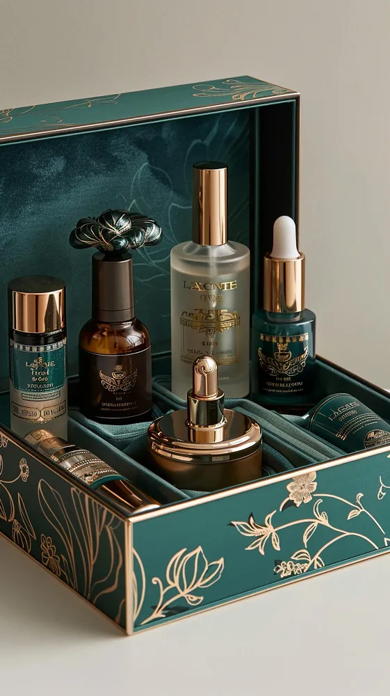
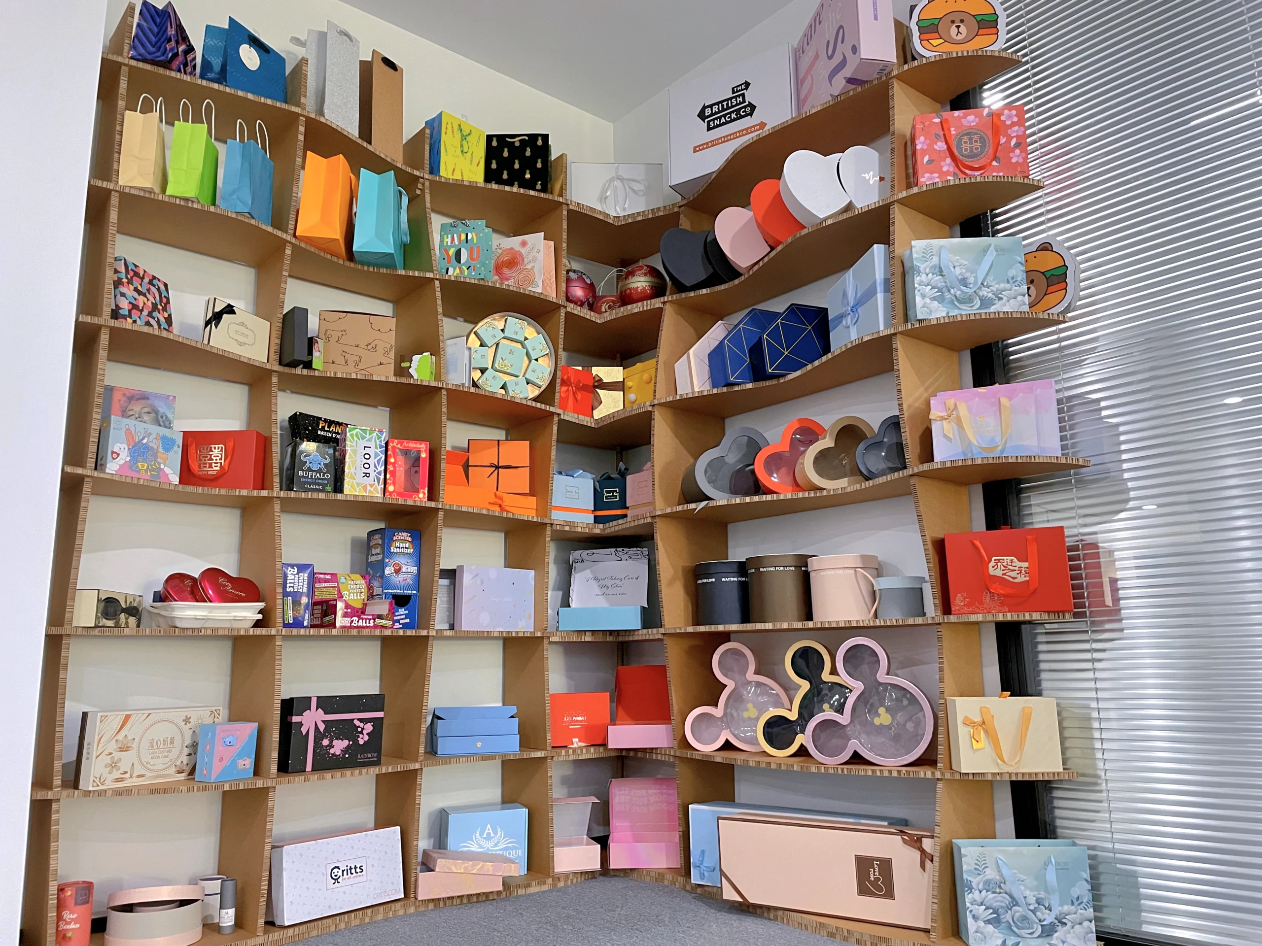
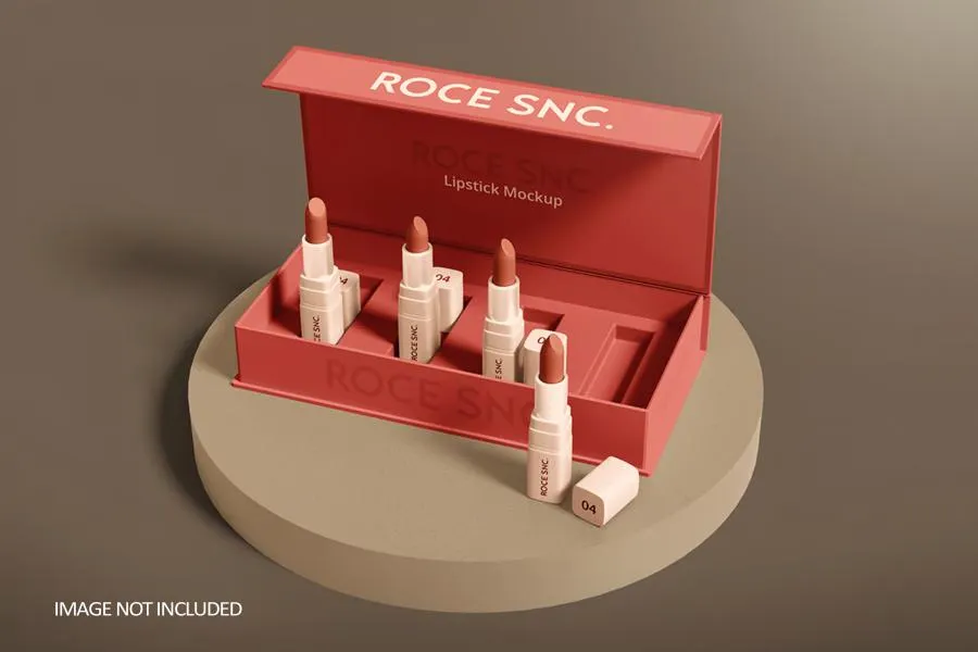
The beauty market is incredibly crowded. It’s frustrating when your great product is overlooked. Let's explore how leading brands use packaging to capture attention and win over customers.
We learn that top brands masterfully combine sustainability, minimalism, and interactive features. Fenty Beauty and Glossier, for example, teach us that innovative materials and thoughtful design build a strong brand identity. This approach helps create a lasting connection with consumers in a competitive market.

It is one thing to see these trends, but it is another to understand how to apply them. With over 16 years in the packaging industry, I have seen firsthand what works and what does not. I remember a client, a small skincare startup, who felt completely overwhelmed by all the options. By breaking down these core trends one by one, we found a clear path forward for their brand. Let’s dive into these specifics so you, too, can find inspiration and clarity for your next project.
How is sustainability reshaping beauty packaging design?
Customers today demand sustainable options. Using wasteful packaging can harm your brand image. Adopting eco-friendly solutions is not just good for the planet; it builds customer trust and loyalty.
Sustainability is driving a shift to refillable containers, mono-materials, and PCR plastics. Brands are proving that eco-friendly does not mean less luxurious. They use materials like glass, bamboo, and recycled paper to reduce waste, showing that responsibility is now a key part of brand appeal.

For a designer like Peter, balancing eco-friendly goals with client budgets is a daily task. I always advise seeing this not as a limitation, but as a design challenge. It is about making smart choices that deliver on all fronts.
Practical Sustainable Approaches
Brands are focusing on a few key areas. Refillable systems are gaining traction because they reduce waste and build customer loyalty. Another big trend is the use of innovative materials like post-consumer recycled (PCR) plastics or bio-resins. Finally, there is a push for mono-material packaging, which makes recycling much easier for the end consumer.
I once worked with a startup on a face cream jar. We used a beautiful, heavy glass jar with a simple paper box made from recycled content. It felt premium and told a clear sustainability story. Here is a breakdown to help decide:
| Strategy | Key Advantage | Main Consideration |
|---|---|---|
| Refillable Models | Lower long-term waste, builds loyalty. | Higher initial design & tooling cost. |
| PCR Materials | Uses recycled plastic, improves brand image. | Material sourcing and color consistency. |
| Mono-Material Design | Simplifies recycling process for consumers. | May limit some complex structural features. |
This strategic view helps balance creative vision with practical and environmental responsibilities.
What role does minimalist design play in modern beauty branding?
Busy, cluttered packaging can overwhelm consumers and look dated. It fails to convey a clear message, getting lost on the shelf. Minimalism cuts through the noise with confidence and elegance.
Minimalism communicates quality and confidence through simplicity. Brands like The Ordinary use clean typography, limited color palettes, and ample white space to build a strong identity. This "less is more" approach lets the product speak for itself, creating a sense of transparency and trust.

As a designer, you know that executing minimalist design is hard. With fewer elements, every detail must be perfect. The goal is to create a design that feels clean and confident, not empty or unfinished.
Deconstructing Minimalist Design
Minimalism succeeds by focusing on three areas. Typography becomes the hero; the font choice itself communicates the brand's personality. A strict color palette ensures the brand is instantly recognizable on a busy shelf. Finally, negative space is not just an empty area; it is an active element that directs focus and signals luxury.
I remember helping a client reduce their design to just a beautiful font on high-quality paper. The package immediately felt more premium, and it actually reduced their printing costs. This is a great result for any designer trying to balance aesthetics and budget. Here’s a quick look at the core components:
| Element | Its Role | Benefit |
|---|---|---|
| Typography | Carries brand personality | Creates a clear voice |
| Color Palette | Builds brand recognition | Makes products memorable |
| Negative Space | Guides consumer focus | Implies quality and calm |
This "less is more" approach shows confidence in the product itself, which is a very powerful message.
How can interactive packaging create a memorable unboxing experience?
Your packaging is often immediately discarded. This means your brand's first physical impression is forgotten. Interactive elements can transform a simple box into a memorable experience for your customer.
It creates engagement through clever structures, hidden messages, or tactile materials. Think of QR codes leading to video content, boxes with peel-away layers, or packaging that unfolds in a unique way. This turns unboxing into a shareable moment, building an emotional connection to your brand.

Interactive packaging does not require complex mechanics. For designers, it is about thoughtful structural choices that create surprise and delight. That physical interaction is what makes an unboxing experience memorable.
Creating Engaging Unboxing Moments
Interaction can be achieved in several ways. A digital link, like a QR code on the box, can take customers to a tutorial video, extending the experience. Then there is structural interaction. This is where I have the most fun as a designer, with unique folds, pull-tabs, or hidden messages. These elements turn the opening process into a fun reveal. Finally, using different textures, like a soft-touch finish or embossing, invites the customer to touch and feel the package, making it feel more valuable.
We once designed a box for a gift set that unfolded to reveal a beautiful inner pattern. It was a simple idea, but it made the product feel like a special secret.
| Interaction Type | Technique Example | Why It Works |
|---|---|---|
| Digital Bridge | QR code to a tutorial | Adds value beyond the product |
| Structural Reveal | Unique folds or die-cuts | Creates a memorable "wow" moment |
| Tactile Experience | Embossing or special textures | Engages the sense of touch |
These elements make the customer feel like they are discovering something special, building a stronger brand connection.
Why is material innovation crucial for standing out in the beauty market?
Every brand uses a cardboard box. Your product can look just like everything else. Exploring innovative materials makes your brand feel different, modern, and far more luxurious.
It communicates a brand’s core identity, from earthy and natural to sleek and scientific. Unique materials like molded pulp, seed paper, or textured paperboard create a tactile experience. This signals premium quality that a standard box simply cannot, immediately setting a product apart.

As a designer, I know the hunt for new materials is one of the most exciting parts of our job. The right material tells a brand’s story at first touch, moving a product from standard to special.
Navigating Today's Material Options
Material innovation is happening everywhere. In sustainability, we are seeing amazing things like molded pulp, which provides protection and has a raw, organic texture. There is also seed paper that can be planted after use. For luxury, it is about elevating the tactile feel. This means using heavyweight paperboard that feels substantial, adding a soft-touch coating for a velvety finish, or choosing papers with special textures. These choices communicate value before the box is even opened.
I recently discovered a paper made from recycled coffee cups. We used it for an urban-focused coffee scrub brand. It was the perfect story.
| Material Class | Example | What It Communicates |
|---|---|---|
| Eco-Material | Molded Pulp, Seed Paper | Sustainability, Natural Origins |
| Luxe Paper | Heavyweight, Textured Stock | Premium Quality, Craftsmanship |
| Finishes | Soft-Touch, High-Gloss UV | Attention to Detail, Modernity |
The material you choose is the first promise you make. It sets the tone for the entire product experience.
Conclusion
Ultimately, the best beauty packaging is a thoughtful blend of sustainability, minimalism, and interaction. It’s about creating a holistic experience that tells a compelling brand story from shelf to home.


